
 Membership
 Network
 Regional Sites & Affiliates


 Events
 Participate
 Resources

 Training
 Credentials
 Government


 Content Channels
 Tools
Tools


 Business Overview





Showing the Way
Planning a signage & wayfinding refresh without creating navigation gaps
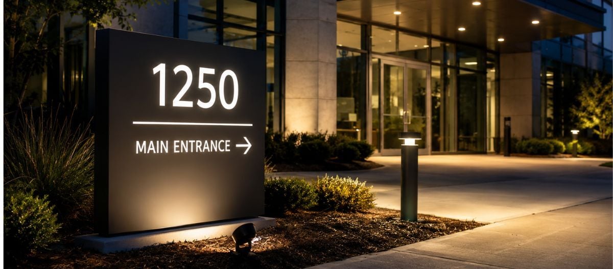
A signage and wayfinding refresh is one of the most visible facility projects an organization can undertake, and one of the easiest to get wrong. New exterior identification signs, updated directories, refreshed parking signage and modernized interior wayfinding all send a message about how a building is operated.
When the transition is poorly sequenced, that message creates confusion rather than clarity. Visitors get lost, vendors miss loading docks, employees miss meetings, and in the worst cases, emergency responders lose seconds that matter.
Facility wayfinding signage is not just a design exercise. It is an operational system that touches accessibility, safety, brand consistency and daily building performance. A well-done refresh improves all these areas at once. A refresh done carelessly can create temporary or even permanent navigation gaps that undermine the very goals the project set out to achieve.
Start with a full signage audit
Before any new sign is designed or ordered, the existing signage inventory should be fully documented.
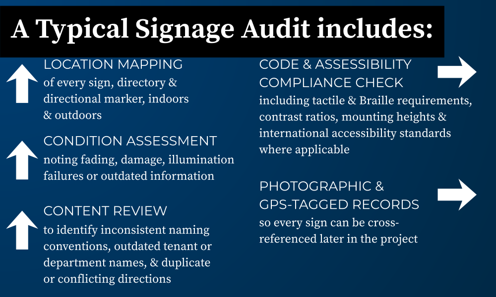 According to research on commercial real estate operations, wayfinding confusion is consistently cited among the top contributors to negative first impressions in multitenant buildings, alongside parking access and entry clarity. A documented audit turns anecdotal complaints — "people always get lost near the east elevators" — into a mapped, prioritized list of problem areas that can be addressed systematically rather than reactively.
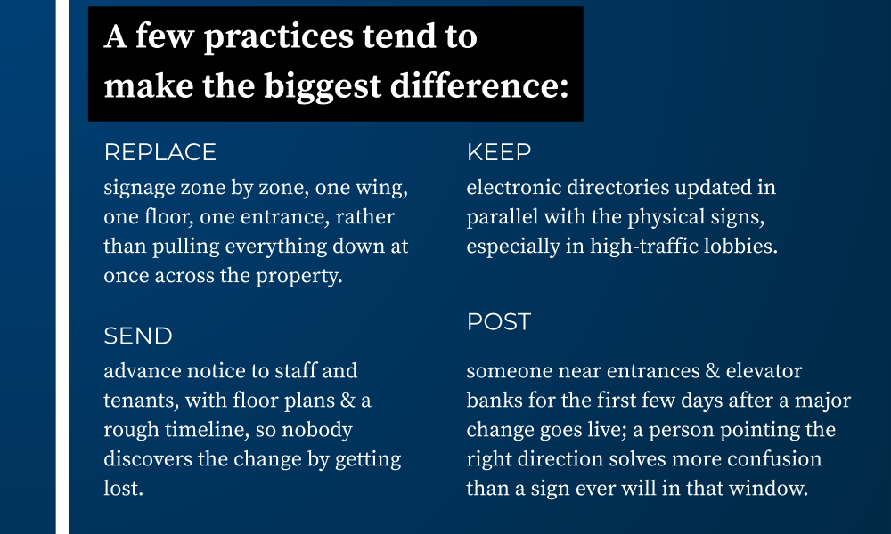
The audit should also capture how people move through the building, not just how the original floor plan assumed they would. Renovations, tenant changes and repurposed spaces often shift real-world traffic patterns away from the logic the original signage was designed around.
Identify navigation pain points before removing a single sign
Once the audit is finished, the real work starts: turning a pile of location data and photos into an actual pain-point map. This means walking the property again, specifically looking for decision points: the spots where a visitor, employee or vendor must choose a direction, and the existing signage does not give them enough information to decide.
 Some of these problems show up in nearly every building, regardless of size or use:
-
lobbies with more than one elevator bank, especially when the banks serve different floor ranges and nothing at eye level explains which is which.
-
parking structures where several entrances lead to different sections of the same building, so a driver arriving from the wrong side has no easy way to correct course.
-
loading docks and service entrances, best evaluated from a vendor's perspective, someone who has never been on site and is not going to guess their way to the right door.
-
exit signage along emergency egress routes, particularly if it has not been addressed since the last major renovation.
-
campus-style properties with buildings that share similar names or overlapping numbering, which creates a slower, more chronic kind of confusion that rarely shows up as a single complaint but adds up over time.
Mapping all of this against the refresh schedule is really about sequencing. It lets the facility team ensure the busiest or highest-risk decision points are never the ones left without adequate signage, even for a short stretch during installation.
Use temporary wayfinding to bridge the transition
Most navigation gaps do not happen because the new signage is poorly designed. They happen in the gap between taking the old signs down and getting the new ones up, sometimes a matter of hours, sometimes weeks if fabrication or permitting runs long. A building should never sit without a functioning wayfinding system, even overnight.
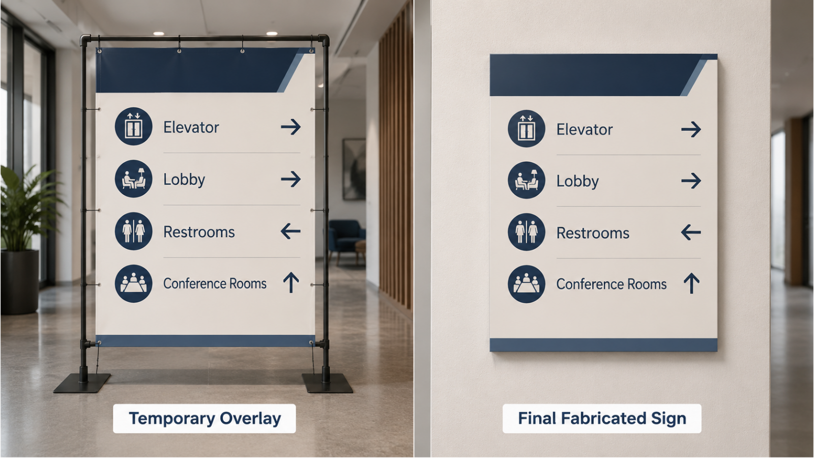
The simplest fix is also the one facility teams skip most often: printed or vinyl overlays that mimic the color coding and terminology of the incoming system. Occupants start learning the new "language" of the building before a single permanent sign goes up, which considerably shortens the adjustment period.
 Teams managing large campus refreshes tend to notice that complaints drop off quickly if the temporary signage uses the same colors and symbols as the permanent system, rather than relying on generic "pardon our progress" notices. It is a small design choice, but it keeps people oriented during the one phase of the project where they are most likely to get lost.
 Check accessibility requirements at every stage
Accessibility cannot be treated as a final compliance check after design is finished. It must inform decisions from the audit stage through installation. Key considerations include:
-
mounting height and reach ranges for tactile and Braille signage.
-
minimum character height relative to viewing distance.
-
color contrast ratios between text and background.
-
non-glare finishes for interior signage under fluorescent or LED lighting.
-
consistent placement logic, such as always mounting room identification signs on the latch side of doors.
Regulations vary by country and jurisdiction, so facility teams working across multiple regions should reference the applicable local accessibility code, such as the Americans with Disabilities Act (ADA) in the United States, the Equality Act in the United Kingdom or ISO 21542 for accessibility in the built environment internationally, rather than assuming a single standard applies everywhere. Building a compliance matrix by property location early in the project prevents costly rework after signs are fabricated.
Coordinate signage with building branding, not just building function
Wayfinding and branding are often planned as separate workstreams, which leads to inconsistent typography, color palettes and material finishes across the same property. A refresh is an opportunity to unify both.
 Facility teams should coordinate with property ownership, marketing and design stakeholders to confirm:
-
a single approved color and typography system for both interior and exterior signage.
-
material and finish standards that hold up to the property's climate and traffic levels.
-
illumination standards for exterior identification signage, as visibility after dark affects both branding and safety.
-
a style guide document that future tenants, vendors or fabricators can reference for consistency.
Exterior identification is often the most visible part of this coordination effort, as it sets the first impression before anyone enters the building. Illuminated channel letters remain one of the most widely used formats for exterior building identification because they combine strong daytime and nighttime visibility with a relatively slim mounting profile.
Review placement & visibility from the user's perspective
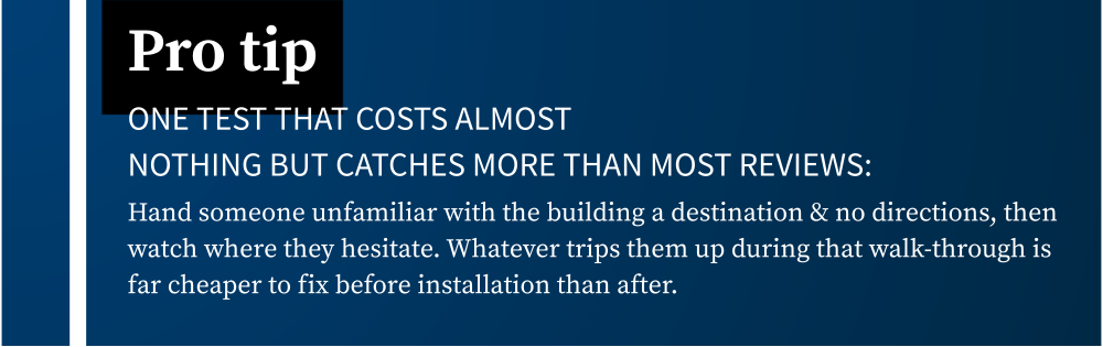
Even a well-designed sign fails if it sits where sightlines are blocked or where the decision point does not match how people actually move through the space. Before locking in installation locations, facility teams are better off walking the property more than once at different times of day, from different entry points and paying attention to:
-
landscaping, furniture or structural columns that block sightlines to a sign that looked fine on the floor plan.
-
lighting levels for both daytime glare and nighttime legibility, which rarely get tested at the same time of day the sign was approved.
-
whether a sign sits at the decision point, not a few feet before or after where someone needs it.
-
height and viewing angle stay consistent across similar sign types, so people are not re-learning where to look every time they turn a corner.
-
long corridors or outdoor pathways that need directional cues repeated more than once, since a single sign at the start of a hallway is easy to forget by the middle of it.
Plan for long-term maintenance from day one
A signage refresh is not a one-time project; it is the start of an ongoing maintenance cycle. Facility teams should build a maintenance plan alongside the installation plan, covering:
-
a defined inspection schedule for illumination, mounting integrity and surface condition.
-
a change-management process for updating directories when tenants or departments move.
-
a stocked inventory of replacement inserts or panels for modular directory systems.
-
clear internal ownership of who requests updates and who approves them.
-
a digital record of sign locations, specifications and vendor information for future reference.
Building this structure at the outset prevents the same fragmentation that likely triggered the current refresh, where signs were updated piecemeal over years without a consistent system behind them.
Bringing the plan together
A successful signage and wayfinding refresh depends less on the design of any single sign and more on the sequencing, communication and maintenance structure around the whole project. Facility teams that audit thoroughly, map pain points before removing existing signs, maintain continuous temporary wayfinding, and build accessibility and maintenance into the plan from the start are far less likely to create the navigation gaps that frustrate occupants and complicate operations. The result is a building that not only looks refreshed but remains genuinely easier to navigate throughout the transition and long after it is complete.

Mohammad Jnaid writes about facility planning, signage systems and the role of visual communication in improving building navigation and user experience. Their work focuses on practical strategies that help facility teams manage wayfinding, accessibility, maintenance and brand consistency across commercial and institutional spaces. They are especially interested in how clear signage supports safer, more efficient building operations.
References
U.S. Access Board guidance on accessible signage
ISO 21542 overview on accessibility of the built environment:
Society for Experiential Graphic Design (SEGD) wayfinding resources
Top image and temporary sign image provided by Banner Freaks.
Read more on Facility Operations and Communication or related topics Operations and Maintenance Planning and Communication Management
Explore All FMJ Topics